Dieser Artikel ist auch auf Deutsch verfügbar
Websites are considered accessible if they conform to the Web Content Accessibility Guidelines at level AA. These guidelines are defined by the Web Accessibility Initiative of the World Wide Web Consortium (W3C) as an international standard. Level AA means that a website is comprehensible to and usable by the vast majority of users. All functions are also accessible to people with disabilities, and assistive technologies such as screen readers can read all relevant information, for example because alternative texts are included for graphics.
All criteria of level A must be met to be in conformance with level AA. These constitute the essential accessibility aspects, such as that a website can be used with the keyboard alone. Level AAA encompasses all criteria of the two previous levels and represents the optimal level of accessibility. However, these criteria are almost impossible to entirely meet, even in the view of the authors. They include, for instance, that a sign language interpreter provide interpretation during live transmissions. According to a recent WebAIM study, 98 percent of a million tested websites are not accessible, in other words they do not conform to the Web Content Accessibility Guidelines at level AA.
Structure of the Crimson Assurance website

The website of Crimson Assurance has two main areas: a customer overview, which also serves as the homepage for the application, and an interface for managing messages. A preview of current messages can be accessed on every web page of the Crimson Assurance site via the main navigation.
The main navigation in the header of each web page encompasses a main menu and a user menu. For demonstration purposes, the main menu shows only the customer overview as a single menu item. The user menu contains a link to the personal messages of the currently logged-in user, a preview of the five most recent new messages from colleagues and a user avatar with the user’s name. Clicking on the user name opens a menu containing a link to log out.
Every main content item on the pages of the application begins with a navigation orientation line in the form of breadcrumbs.
The customer overview permits searching by customer name. The results list is assembled dynamically during the search. Logged-in users can also view their most recently contacted customers – optionally limited to 5 or 20 entries. An overview of all customers ever contacted is also available.
After a customer is selected, a customer summary displays the customer’s personal data as well as their concluded contracts and extended offers. The messages overview shows received and sent messages from and to colleagues of the logged-in user.
The inbox and outbox for messages can be sorted by date and grouped by status: read or unread. A full text search of all messages or within filtered messages is also possible. The displayed messages appear in blocks of ten. This page structure can be navigated via native HTML buttons.
Selecting a message takes the user to a details page with the typical information of sender, subject, and content. After opening a message, the user can delete it, forward it, or mark it as unread. From this details page, it is also possible to navigate to the previous or next message or to return to the messages overview.
The messages overview page allows navigation to a page to compose a new message. To write and send a message, the name of the recipient, a subject, and the message content must be entered. The user can also navigate from this page back to the messages overview.
The example has been intentionally kept simple to demonstrate and describe the principles of accessible product development based on only a few pages and minimal content. The explained techniques and principles can be transferred to any other contexts and by analogy to domains beyond the web as well.
Speech output via tag
Correct pronunciation of words by a speech synthesizer, a common output mode of screen readers, requires that developers first specify the language of the entire webpage in the “lang” attribute of the tag. To ensure that words in languages other than this are comprehensible, further adaptation is required.
For example, it is difficult to understand English terms rendered by a speech synthesizer set for German and therefore using German pronunciation. Individual English words in the content area of a page must therefore be marked accordingly by the developers using the “lang” attribute. Words that have been assimilated into German, such as “computer” and “keyboard” are exceptions here.
The language is specified in the “lang” attribute using international language codes, such as “de” for German or “en” for English. Language variants are indicated in the international language code by appending another code to the base language, separated by a hyphen, such as “de-de” for the style of German spoken in Germany or “en-us” for American English.
The correct syntax looks like this:
<html lang="de-de">The header
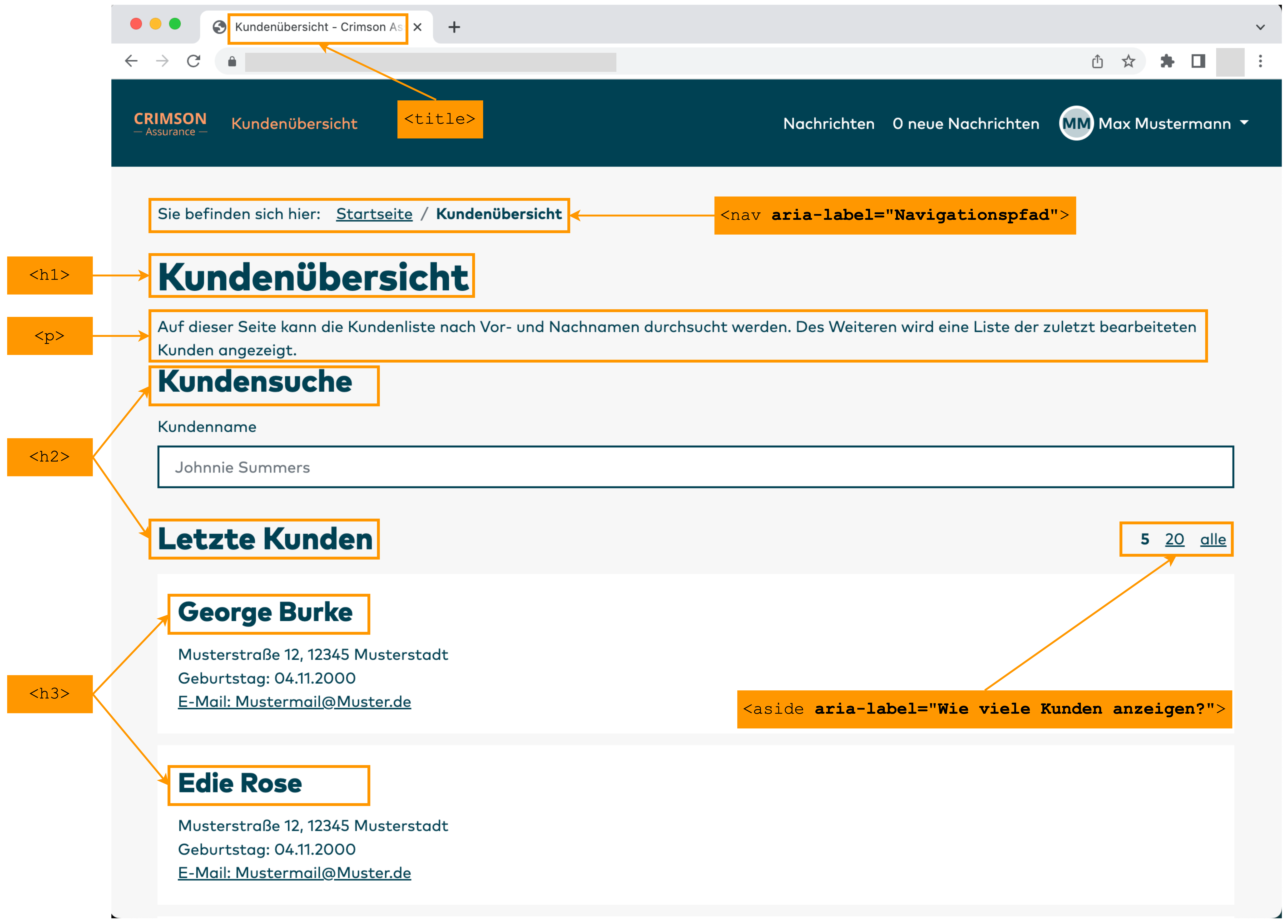
In the header of a web page, which is enclosed by <head> and </head>, it is possible to specify a meaningful and easily understood title with the <title> tag. This makes the page easier to find when switching between open browser windows.
A general title, such as the name of the company, is not sufficient for this. The title should refer to the main purpose of the respective web page. This means it is inadequate to specify “Crimson Assurance” as the title. For the login page, for example, “Crimson Assurance – Login” makes for a suitable, clear title. The company name itself should always be part of the title.
In the case of frequently changing interactive content on various pages of a web application that serves a variety of objectives, it can be useful to indicate the main activity at the start of the title. For purely informative webpages, the main topic of the respective web page may also be indicated after the company name.
Meaningful titles for Crimson Assurance are: “Login – Crimson Assurance”, “Customer Overview – Crimson Assurance” and “Messages – Crimson Assurance”.
Landmarks
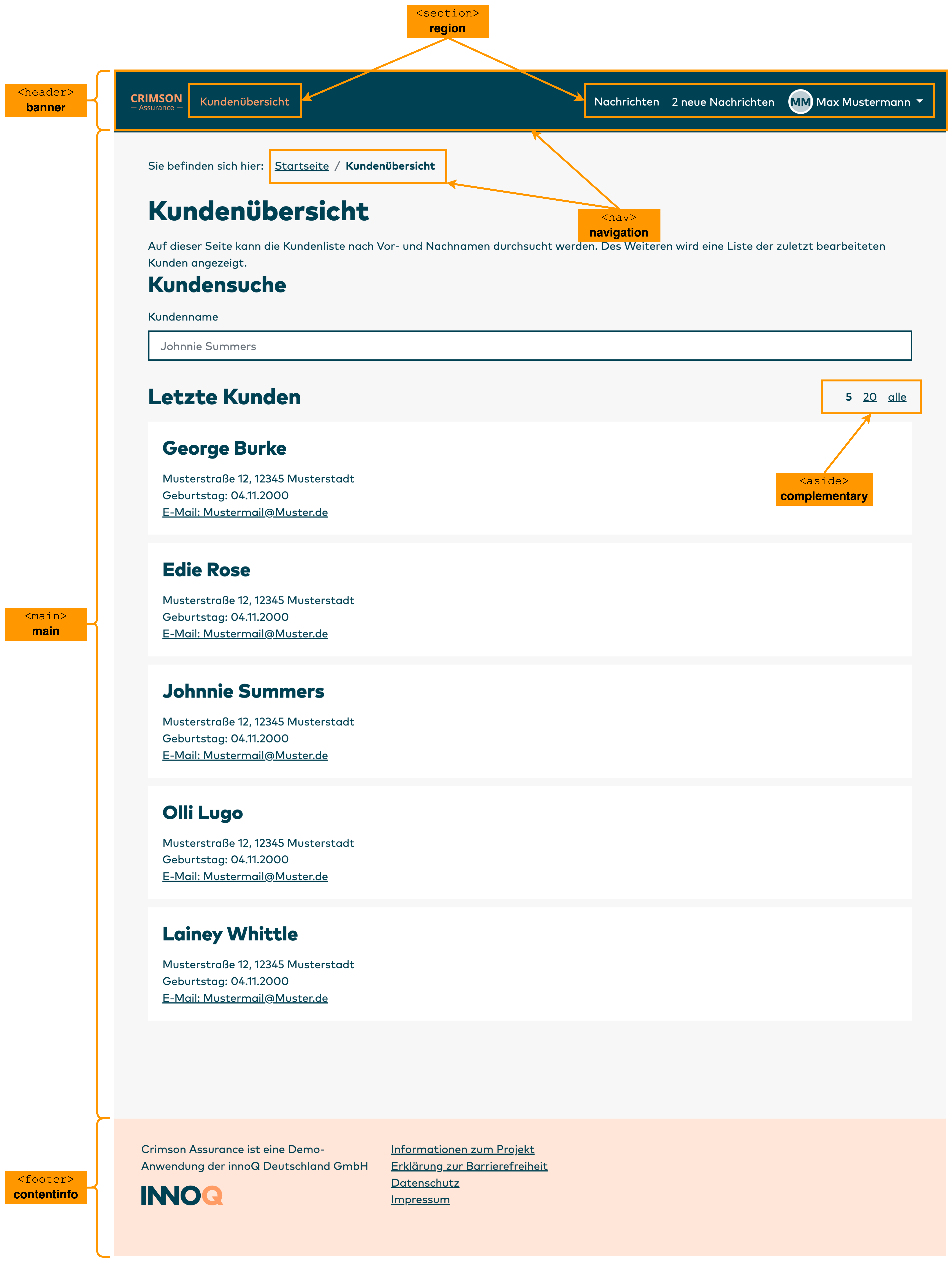
Landmarks, which were introduced by HTML5, can be used to do more than create a well structured web page. They also ensure that the most important areas of a web page can be identified and skipped to quickly. The following landmarks should always be used:
-
<header>for the page header -
<main>for the main area -
<nav>for a navigation area -
<footer>for the footer
Two additional landmarks are also very useful:
-
<section>for important regions within one of the above landmarks for the main structuring -
<aside>for areas without main content but that can be used to modify it, such as a sidebar
Some landmarks can be used natively since the introduction of HTML5. Other landmarks are available with the help of ARIA via the role attribute within an HTML tag. ARIA stands for Accessible Rich Internet Applications and serves to extend HTML to mark up UI elements semantically. ARIA should only be used if HTML does not already natively provide the required semantic information.
Table 1 shows the native HTML landmarks, their corresponding ARIA roles, and the outputs when using a speech synthesizer. The outputs differ from screen reader to screen reader. The indicated outputs refer to the screen reader used by the authors to check the accessibility of the demo application. The output “skip mark” should not be confused with the “skip links” described below.
| HTML | ARIA role | Output |
|---|---|---|
<header> |
banner | Banner skip mark |
<main> |
main | Main skip mark |
<nav> |
navigation | Navigation skip mark |
<form> |
form | Form |
<aside> |
complementary | Complementary |
<footer> |
contentinfo | Content info |
<section> |
region | Region |
The landmarks can be labeled with aria-label. These designations are sent exclusively to assistive technologies and do not appear visually. With a screen reader, a user can skip from landmark to landmark with a single keypress. If the landmark is not labelled with aria-label, there is no announcement of which landmark the user is at after the skip. This also applies to native HTML5 landmarks. In this case, only navigating to the next line will provide feedback for orientation.
The header of the Crimson Assurance site, which received the <header> landmark, also has a <nav> landmark. This marks a navigation menu, as is typically found in a web page header. To make clear that this is the main navigation element, the <nav> landmark receives the label “Main navigation” via aria-label. There could also be multiple navigation landmarks on a web page, such as for breadcrumb navigation or navigating through paginated content.
The full <nav> landmark in the header of the Crimson Assurance site looks as follows:
<header>
   <nav aria-label="Main navigation">
   ...
</header>
Navigation menus

An accessible navigation menu dispenses with expanding elements and deep nesting. Native unordered HTML lists with the <ul> tag are preferred. Each list must be labelled with aria-label.
The Crimson Assurance site embeds the entire header within a <nav> tag, which is labelled as “Main navigation” via the aria-label attribute. aria-label assigns labels to objects that do not appear visually but can be read by assistive technologies. The main navigation is divided into two navigation areas, consisting of a main menu with the general main areas of the website and a user menu with individual messages and settings for the specific user. Both menus are labelled accordingly as main menu and user menu with aria-label.
A screen reader detects the labelling of a list and outputs this once the user focuses on a list, in other words skips to it or moves the cursor to a list element. Because there are two semantically separated lists for navigation, it makes sense to additionally label each as its own area. There is therefore a <section> tag with the same label as the respective list above each navigation list.
The reason for this redundant labelling is that both a <section> landmark and a list can be skipped to. When skipping to a landmark, the screen reader only outputs the text assigned to this landmark. The same is true when skipping to a list, in which case the landmark and its label are not output. Depending on which element a user navigates to, they should be informed of where they are. With labelling of the <section> and the corresponding list, the screen reader outputs: “Main menu region main menu list with 1 entries”. “Main menu region” is the output for the <section> label and “Main menu list” for the list label. In other words, the user learns that they are located in the list “Main menu” within the region “Main menu” as well as how many entries the list has.
The same labelling of the list and the region is not absolutely necessary, but it simplifies orientation when a region contains only one element. If this element had a label that differed from the region, the user could be confused and search for the element that corresponds to the label of the region.
The syntax of the region with the main menu on the Crimson Assurance site is:
<section aria-label="Main menu">
   <ul aria-label="Main menu">
      <li> ... </li>
      ...
   </ul>
</section>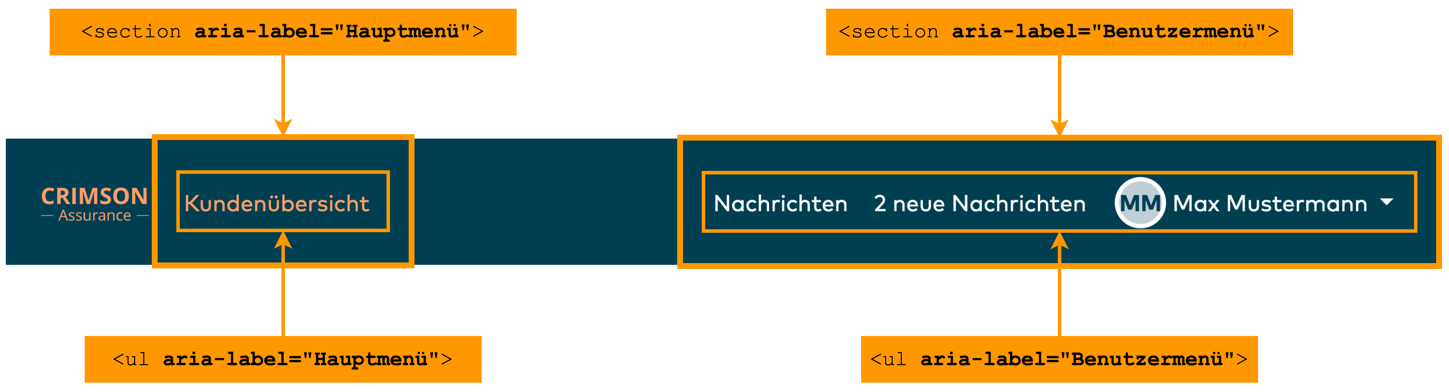
Position marker

A navigation menu typically indicates the currently active navigation point. This is generally indicated purely visually with a specific color, underlining, or an icon, sometimes also with an angle bracket > in front of the menu entry. None of these markings are accessible. aria-current="page" tells users of assistive technology which navigation point is currently selected. Visually, this indication has no effect. The indication of aria-current="page" results in an output of “Current page” to the user, followed by the navigation point. An alternative to this would be aria-current="true", resulting in an output of “Current”. When indicating the currently active web page, aria-current="page" therefore makes sense, while aria-current="true" is preferred for indicating a currently selected element on a page.
On the Crimson Assurance site, the syntax for reporting the current page is:
<ul>
   <li>
      <a class="nav-link active"
      href=".../portal/de" aria-current="page">
         Customer overview
      </a>
   </li>
   <li> ... </li>
   ...
</ul>
Logos
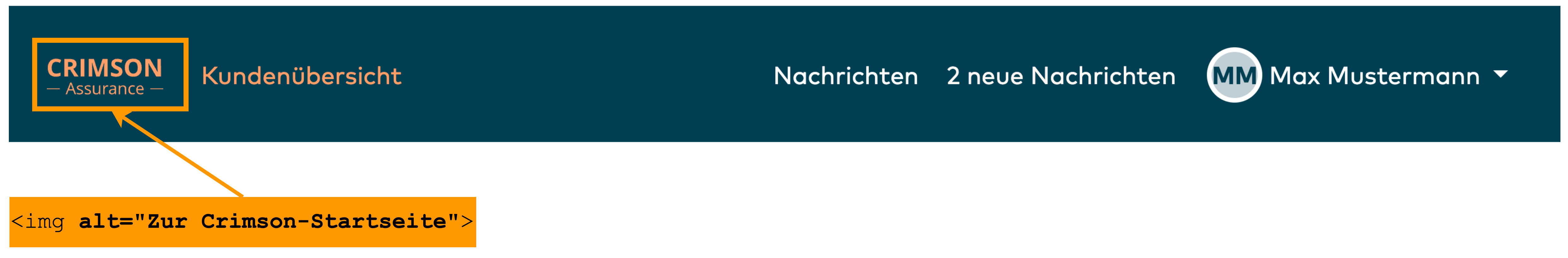
In addition to the navigation menu, the header of a web page typically also contains the logo of the page operator, and clicking on this takes the user to the homepage of the site, making corresponding labelling superfluous. However, users of assistive technology always profit from indication of the target of a link.
Browsing the internet can quickly result in the opening of a number of windows, tabs, documents, applications, and possibly an email client, or the user may return from a break and no longer recall which page they had visited and which window is currently selected. The logo is generally the first UI element encountered on a website by the user, including when switching between tabs. Indication of the logo function – typically navigating to the homepage – makes it easier for users of assistive technology to orient themselves on the website. As with the page title, it is important here to include the name of the page operator. The alternative text of the logo graphic should describe its function using the alt attribute.
The frequently encountered description “To homepage” is insufficiently informative, however. The Crimson Assurance logo has the alternative text “To Crimson homepage”. The word “logo” and a description of the logo appearance are not necessary here as long as the logo is not intended to convey any emotions (such as a leaping horse) or displays meaningful, well-known objects (such as a stylized apple with a bite out of it).
Here is the syntax for the Crimson Assurance logo with alternative text:
<a href="...">
   <img alt="To Crimson homepage" src="/logo-crimson.svg">
</a>
Structuring the main content
Structuring the areas of a web page is necessary both to provide orientation and for the logical exploration of the page. This structure is created with seamless headings, a meaningful tab order, and the use of landmarks.
On the Crimson Assurance site, for example, the homepage with customer overview is structured as follows: The first element of the main content area is a breadcrumb navigation line to inform the user where they are within the site. Only after this does the main level 1 heading indicate the topic of the web page. Every web page must contain exactly one main heading, designated with the <h1> tag. The page title can be the same as this main heading. This makes it easier for users to orient themselves because they select a window based on the page title and learn from the main heading whether they are actually on the desired page. The other heading levels 2 to 6 should be used based on the structure of the web page.
On the Crimson Assurance site, the main content beneath the level 1 heading is divided into the semantically meaningful areas CUSTOMER SEARCH and LAST CUSTOMERS using level 2 headings. Both of these areas are equivalent because the following activities can be performed on the web page: accessing customer data, either with a customer search or via an overview of the last customers.
In both areas, the data of the customers is structured at heading level 3. In other words, exploration of the page follows the granularity of information in the main content area.
It is important to avoid gaps in the heading structure. For example, if the customer data were at level 4 or the display of the last customers were not at the same level as the customer search, a user could become confused and search for the presumably missing heading. The structuring of information at a lower level could cause users to ponder the significance of this, thereby distracting from the actual activity.
The level 2 headings offer screen reader users a quick overview of the most important areas within the subject area described by the level 1 heading. The areas below the level 3 headings are only relevant after obtaining an overview of the general main areas of the web page. For example, if the area with the last customers were situated at level 3 instead of level 2, it would not structurally have the same significance as the customer search, and a user would mistakenly take it to be a sub-item of the customer search. If further subordinate information about the customer were to be presented, the heading levels 4, 5, and 6 could be used for this.
Sections beneath a heading should always be placed within the <p> tag. Screen readers can navigate directly to this tag. The tags <article> and <section> can be used for further subdivision: <article> is a self-contained content area, which can also stand on its own and is reusable. <section> is a section with heading that is part of a larger whole, such as an <article>, and cannot stand on its own. Both <article> and <section> typically contain paragraphs in <p> tags.
Paragraphs in <div> tags or <span> tags do not convey any semantic information and are also not recognized by a screen reader as meaningful areas that can be skipped to directly, even if it does identify the text itself as such.
Skip links
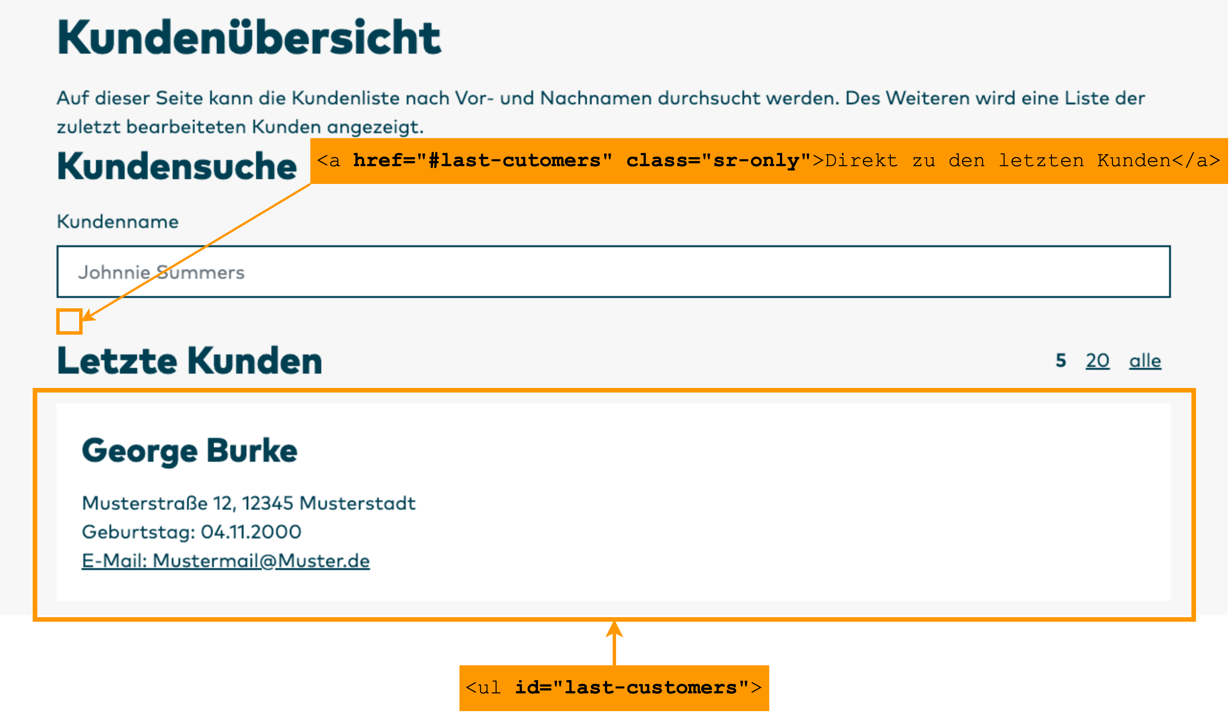
The Crimson Assurance site offers the user an overview of the customers they have contacted. The user can choose how many customers are shown in this area: 5, 20, or all customers are available as an option, with 5 as the default. This selection is implemented as a list. The list is labelled with aria-label="Wie viele Kunden anzeigen?" and can be skipped to directly by naming this label.
Such a selection list can be very long, depending on which display options are offered to the user. On the Crimson Assurance site, a more finely graduated selection option with steps of 5 or 10 would be conceivable as well as the most frequently contacted customers or the like. This could result in a very long list. This is why the Crimson Assurance site offers an option above the list to skip directly to the last customers, thereby skipping the list with the customer display options. The longer the list, the more useful such a skip link becomes. Users of a screen reader can attempt to bypass the selection list by skipping to the next section, the next heading, or the next landmark. In this case, however, it cannot be known whether the focus will then actually be on the element immediately following the selection list. This requires additional orientation upwards or downwards from the current position, which can take even longer than simply going line-by-line through the selection list.
A skip link only helps users of assistive technologies and therefore should not be conveyed visually. When an element is intended to be accessible only to assistive technology, such as a screen reader, the skip link can be moved out of the visible area and set to a size of 1 pixel. An HTML or ARIA attribute for making an element visible only to assistive technology unfortunately does not exist. However, Bootstrap does offer this with the class sr-only. A similar situation applies to other frameworks.
On the Crimson Assurance site, the list for selecting the number of last customers to display can be found under the landmark <aside>. This landmark is intended for exactly such options that do not correspond directly to the main content. While the options do change the display of the content, the selection list is not actually part of the main content. <aside> is well suited for sidebars and toolbars.
On the Crimson Assurance site, it is possible to change the number of displayed customers via the adjacent area within the aside landmark. A screen reader receives this function again in direct form via aria-label. In addition, a screen reader receives the option of skipping the selection area and going straight to the start of the last customers. Because this option is only useful with a screen reader, it can be visually hidden with sr-only.
The entire syntax on the Crimson Assurance site is:
<h2>Last Customers</h2>
<a href="#last-customers" class="sr-only">Go directly to the last customers</a>
<aside aria-label="Number of customers to display?">
<ul>
<li>
<a href=".../portal&size=5">
5
</a>
</li>
<li> ... </li>
...
</ul>
</aside>Footer
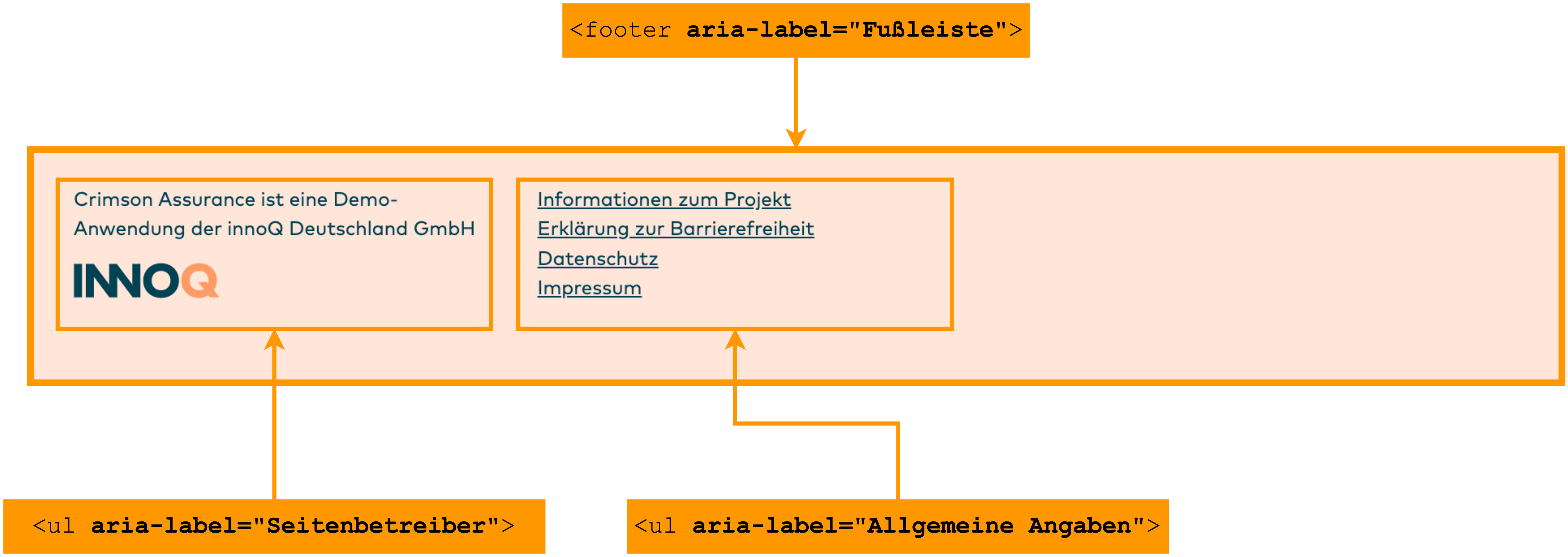
Similar to navigation in the header, the footer also consists of two lists, which are semantically separated based on the information they contain. The first list, which is labelled with aria-label="Seitenbetreiber", contains the information about the operator of the website and a brief note about Crimson Assurance. The second list is labelled with aria-label="Allgemeine Angaben" and contains a link to more detailed information about the project, an accessibility statement, the legally required data protection information, and the publishing information.
The source code of the Crimson Assurance footer looks as follows:
<footer aria-label="Footer">
    <ul aria-label="Site operator">
        <li>
            <p>
               Crimson Assurance is a demo application
               of innoQ Deutschland GmbH
            </p>
        </li>
        <li>
            <a href="...">
               <img alt="To INNOQ homepage"
               src="/portal/static/logos/innoq-logo--petrolapricot.svg">
            </a>
        </li>
    </ul>
    <ul aria-label="General information">
       <li>
          <a href=".../portal/prject">
             Information about the project
          </a>
       </li>
       <li>
          <a href=".../portal/accessibility">
             Accessibility statement
          </a>
       </li>
       <li>
          <a href=".../de/datenschutz/">
             Data protection
          </a>
       </li>
       <li>
          <a href=".../de/impressum/">
             Publishing information
          </a>
       </li>
    </ul>
</footer>