Dieser Artikel ist auch auf Deutsch verfügbar
Native HTML elements and easily learned ARIA specifications can be used to convey the content of a web application in an accessible way. The first part of the series described the structure of an accessible website using the example of the fictitious insurance company “Crimson Assurance”. Knowledge of this article will help with understanding this second part, but it is not absolutely required.
The code examples also do not represent the only possibility for implementation; they are merely the ideal solution within the context of the example application. They are intended to explain the most important elements of the accessible presentation of the content of a web application and to offer insights into the technical aspects. The names of the employees shown as well as the insurance company itself are fictitious.
Breadcrumb Navigation
The main area of each page of a web application begins under the landmark <main> with a breadcrumb navigation line. This allows a user to identify their position within the website structure, offering another way in addition to the main heading to determine whether they have actually arrived at the desired page. Moreover, a user can use this navigation feature to travel along the previous path back to the homepage. In addition to easier orientation, this also provides a way to convey more detailed information about the website structure than is possible in the main navigation.
With regard to accessibility, breadcrumb navigation should be clearly identified as such. This frequently takes place with an indication such as “You are here:”. The indicator should be clear not only to screen readers but to everyone since the visibility of the indicator is what makes it possible to quickly find the navigation element and thereby the current position.
In the source code, the entire area should be located below a <nav> landmark. Just like the main navigation, this <nav> landmark should also be labelled with aria-label. On the Crimson Assurance site, this navigation is called “Navigation path”, and this label is not visible. “ARIA” stands for Accessible Rich Internet Applications and serves to extend HTML to mark up UI elements semantically. This should only be used if HTML does not already natively provide the required semantic information.
The path should appear as a sorted list using the <ol> tag. The list is labelled with “Navigation path” via aria-label just like the <nav> landmark. The last entry is labelled as the current page using aria-label="page".
The redundant labelling of the landmark and the list directly indicates where the user is on the web page regardless of whether they skip directly to the landmark or directly to the list.
Here is the breadcrumb navigation on the Crimson Assurance customer overview page:
<nav aria-label="Navigation path">
   <span>You are here: </span>
   <ol aria-label="Navigation path">
      <li>
         <a href=".../portal">Homepage</a>
      </li>
      <li>
         <a href=".../portal">
             Customer overview
         </a>
      </li>
      <li>
         <a href=".../portal/customers/a2" aria-current="page">
             Customer summary
         </a>
      </li>
   </ol>
</nav>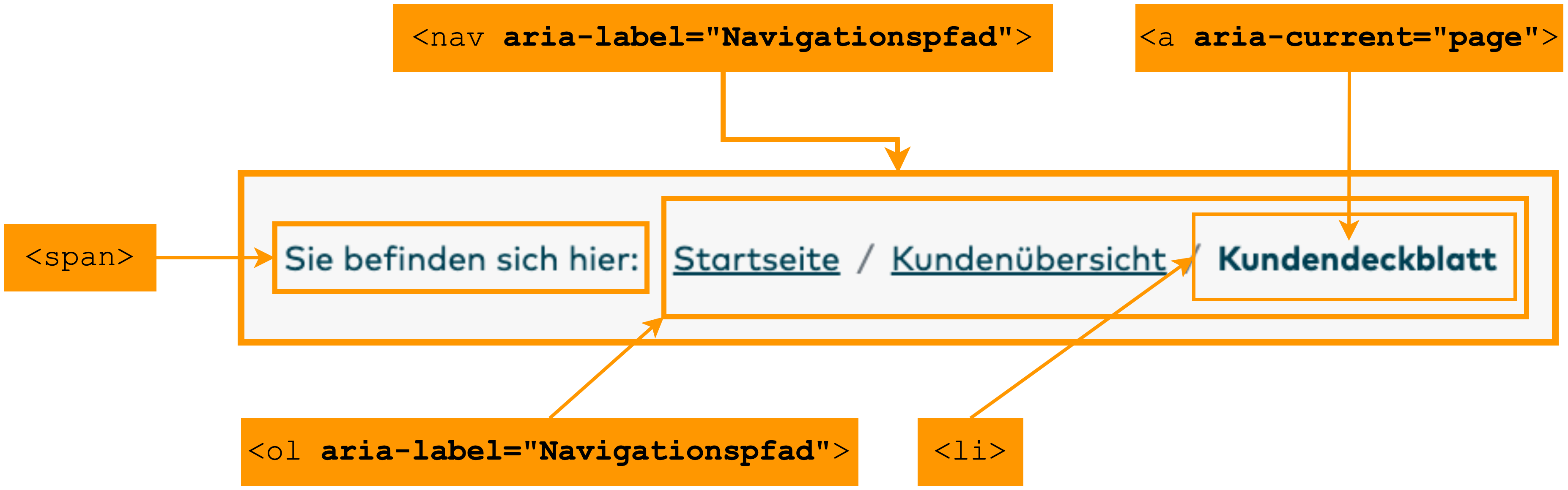
Search Boxes
Crimson Assurance offers the ability to search for customers on the customer overview page. The search box is labelled using <label for=""> “Customer name”. The connection to the search box is established via the ID, which clearly associates the label with an element. A label can be assigned to precisely one element, and one element can receive precisely one label. Labels offer a clear way of labelling an element to make it identifiable by assistive technology.
Furthermore, the label of an interactive element like an input box is clickable to position the cursor in the input box. A screen reader frequently reads out a label in a previous, separate line. The focusing of an element is significantly more efficient because these lines can be easily clicked to set the focus on the corresponding input box.
Even if the label is on the same line before the input box, it is simpler to skip to the start of the line and click than to immediately move the focus to the input box. For users with impaired motor function, HTML labels are very helpful since they enlarge the clickable area. The syntax of the box field with the label “Customer name” on the Crimson Assurance site is:
<form id="customer-search-form">
   <label for="customer-search-input">Customer name</label>
   <input id=" customer-search-input">
</form>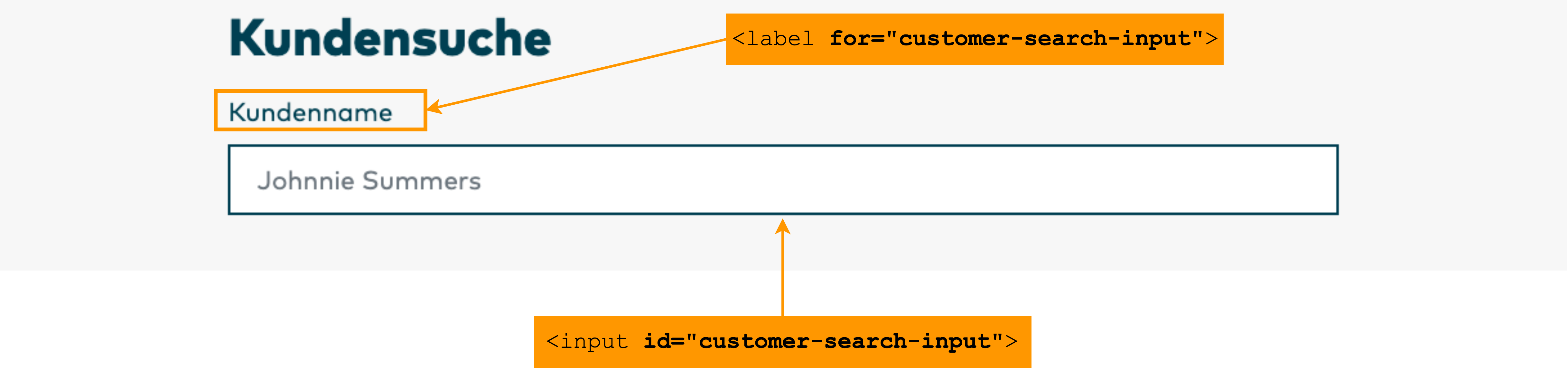
A search box is semantically labelled with the <input> type attribute search. An assistive technology can convey this information to the user. This tells them directly what type of input box it is and which action can be performed.
Especially for a search box on a personal web page, autocomplete is a useful feature. This assists users who have difficulty concentrating while also generally speeding up the search for frequently contacted customers.
In contrast, a placeholder does not explicitly improve the accessibility. In fact, experts often advise against the use of a placeholder because all information offered there by way of assistance would be better off appearing in the label. On the Crimson Assurance site, a placeholder in the form of a customer name is used as an example of a possible input. Because this does not require any specific format, the placeholder is actually not necessary. It serves here as an example for how to use a placeholder. For example, if a placeholder is intended to indicate a specific date format, it would be better to indicate this in the label of the input box. This way, if an incorrect format is entered, the correct format is still visible when making the correction. Since a placeholder does not appear again after an entry has been made, the user would otherwise be forced to recall the required format from memory.
On the Crimson Assurance site, the customer search is the first main activity of the web page “Customer overview”, above the second main activity “Last customers”. The autofocus attribute of the search box places the cursor directly in the search box when the page is loaded so that a user can search for a customer immediately after loading the page without having to navigate to the search field.
The syntax for the search box on the Crimson Assurance site is:
<input type="search" autocomplete="on" placeholder="Johnnie Summers" autofocus>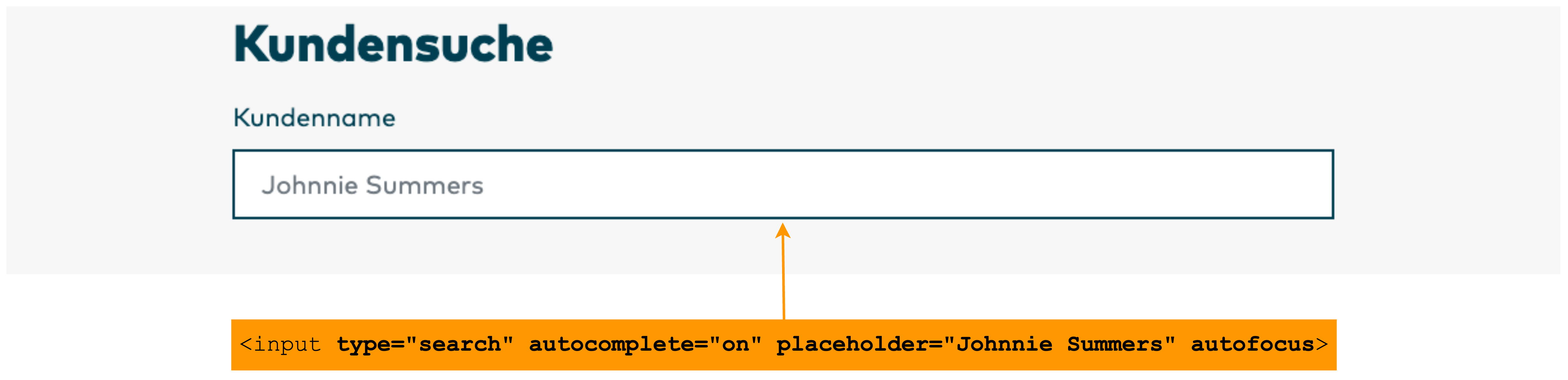
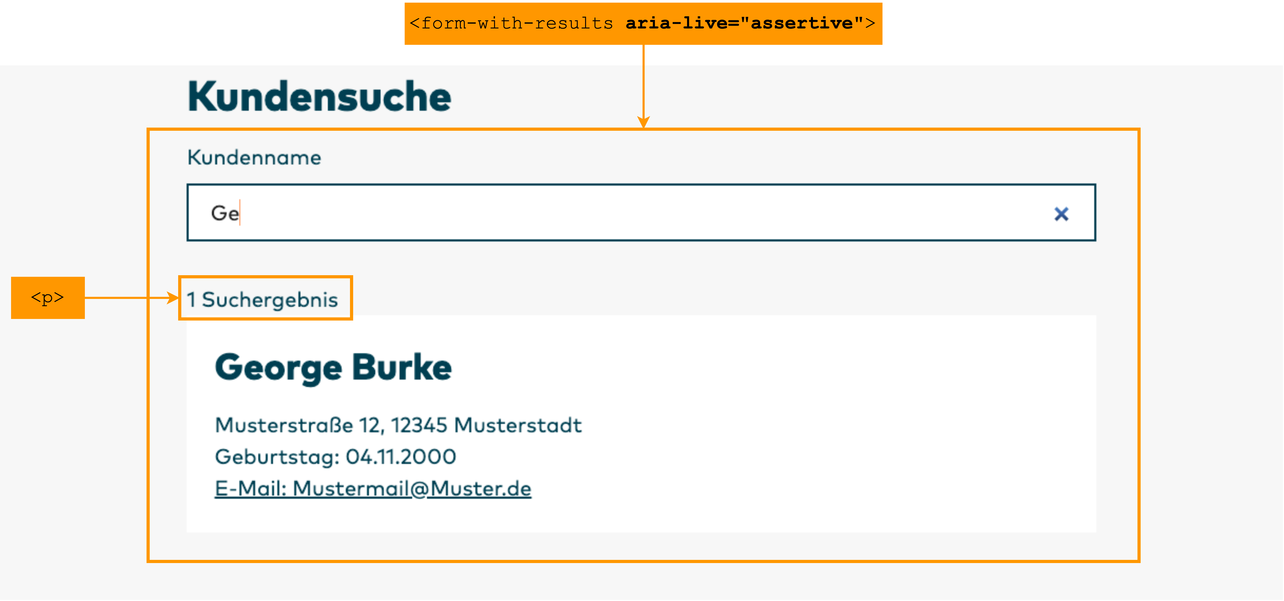
Crimson Assurance shows customer search results after the entry of at least two characters in the search box. The list of matching customers is dynamically created and changes with the entry of additional letters. A screen reader will not immediately detect that content has changed in an area other than the focused one. Without further information passed by the application to the screen reader, a user must leave the search field after the entry of the first two characters (and every additional one) to check how many customers have been found. This is a laborious and unsatisfactory situation.
To convey to an assistive technology, such as a screen reader, that an area of a web page changes dynamically due to user activities, developers can assign the dynamic area the ARIA attribute aria-live with the word "assertive". aria-live marks the area of a website that changes dynamically and should therefore be “watched” by a screen reader. This makes it unnecessary to repeatedly rescan and read out the entire page to follow the changes.
The value "assertive" specifies that the changes are urgent information that the page must provide immediately to the user. With a dynamic search, for example, it can be useful for the page to immediately report the number of search results while a user is still typing or when the user pauses typing for a short time to hear the number of search results.
On the Crimson Assurance site, the area of the search results is labelled as a dynamic region and prioritized as "assertive". As of the second letter entered, the page immediately reports the number of search results. In addition, all search results are read out. This gives a user the opportunity to hear the number of search results as well as the search results themselves without having to change the cursor focus. If the number of search results alone is sufficient, the user need not listen to the reading of the entire list of results in order to continue searching. They can simply interrupt the output at any time.
Filter Options
The Crimson Assurance site permits filtering of both received messages and sent messages based on multiple options: full text search, sorting by date, by read or unread, and the option of showing only unread messages. In order that assistive technology can interpret this group of filter options as a semantically related group, the group is enclosed with <fieldset>. Regardless of whether the group is encountered during line-by-line reading from top to bottom or whether the user skips directly to the search box, the selection list with the other filter options, or the checkbox with the option to show only unread messages, the user is always informed that they are in a group with filter options.
This is accomplished by specifying and labelling the group with <legend> in addition to <fieldset>. On the Crimson Assurance site, the filter group is labelled with “Filter inbox”. This label is not visible; it is only made available to assistive technologies by means of "sr-only". Visually, it is already clear that this is a group of options for filtering the messages. Making the label invisible results in a less cluttered page.
The syntax on the Crimson Assurance site for filtering the inbox is:
<fieldset>
   <legend class="sr-only">Filter inbox</legend>
   <label for="inbox-search">Search</label>
   <input type="text" name="inbox-search" id="inbox-search" value="">
   <label for="in-message-sort">Sort by</label>
   <select id="in-message-sort" name="inbox-sort">
      <option value="date-desc" selected>
         Date (newest first)
      </option>
      <option value="date-asc">
         Date (oldest first)
      </option>
      <option value="unread-first">
         Status (unread first)
      </option>
      <option value="unread-last">
         Status (read first)
      </option>
   </select>
   <input id="only-show-unread" name="only-show-unread" type="checkbox"
   value="true">
   <label for="only-show-unread">
      Only show unread messages
   </label>
   <button type="submit">
      Filter
   </button>
</fieldset>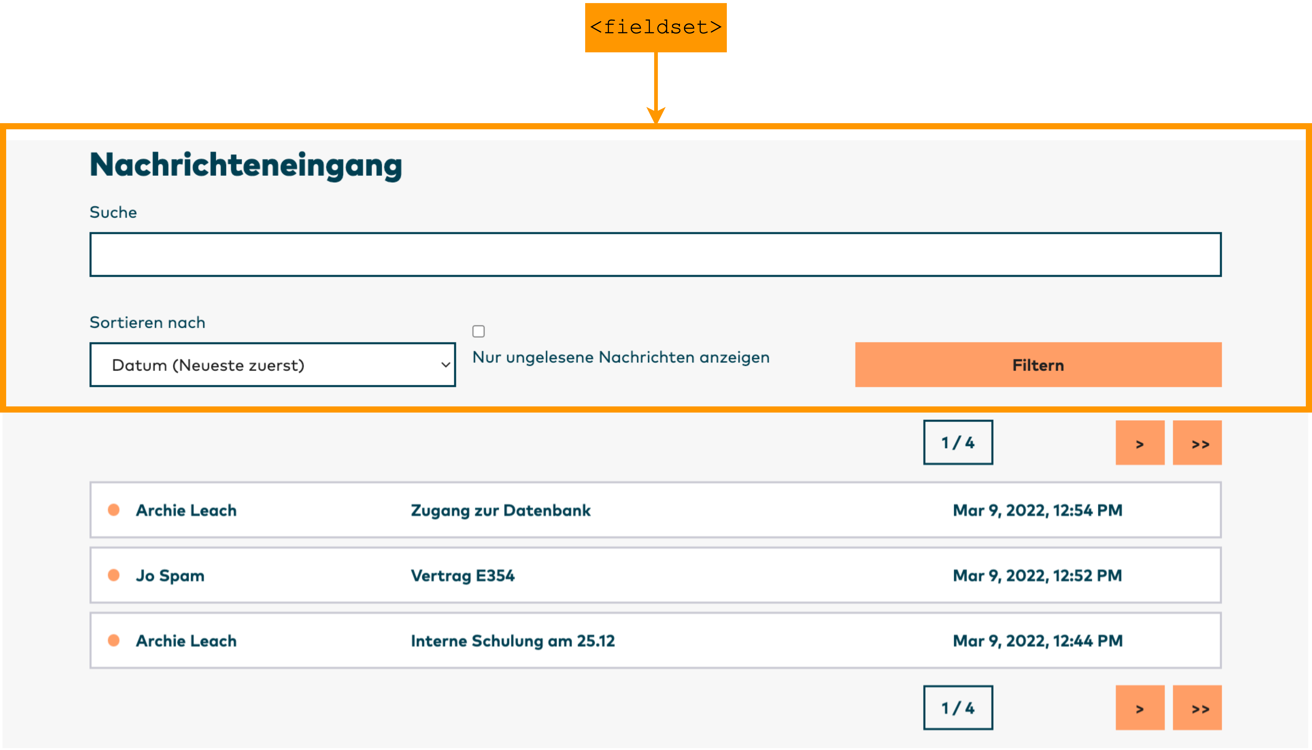
Pagination
The example website shows received and sent messages at the same time. Both are located on the same web page in separate areas with separate filtering options. Pagination with ten messages on each overview page is implemented for both overviews. For the purposes of accessibility, buttons are used for the pagination that are grouped within a navigation area using <nav>. These navigation areas are labelled with aria-label="Durch eingegangene Nachrichten blättern" and aria-label="Durch ausgegangene Nachrichten blättern".
At the start of these navigation areas, the user is informed how many pages are in the messages overview and which page they are currently on. Only the pure numbers are actually visible here, such as “1 / 4”. An assistive technology should output what these numbers mean since this is not clearly discernible via the visual positioning of the information in relation to the search results pages. This additional information is provided by the Crimson Assurance site with the command aria-description:
<p aria-description="Seite">1 / 4</p>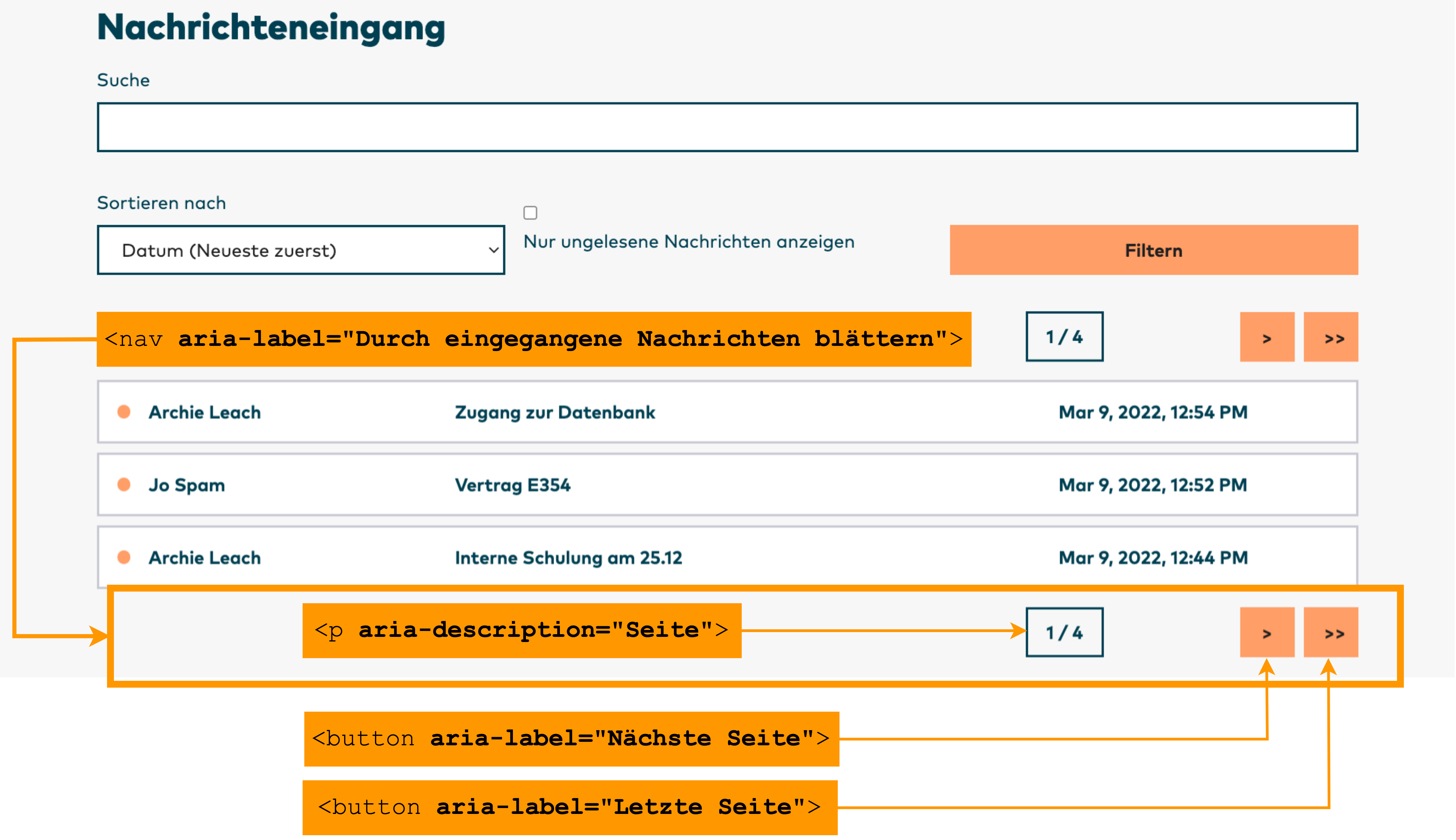
The buttons “Next page”, “Previous page”, “First page”, and “Last page” page through the messages overview. These are shown or hidden based on the current page so that only the actions that result in changing the page overview are available. For example, the buttons “Previous page” and “First page” are absent from the first page.
The labelling of the buttons is not visible; it is only conveyed to assistive technology via aria-label. Symbols are displayed visually, which are assigned to the buttons via CSS. Here as well, a measure for improved accessibility does not in any way hinder the appearance or get in the way of the creative design of a modern interface.
The navigation through the various pages of displayed messages is repeated below each page, in other words beneath the tenth message on the Crimson Assurance page. This makes it unnecessary to locate the pagination menu again first. Users with concentration deficits or orientation difficulties benefit from this in addition to users of screen readers, who can page through the results at this location and efficiently skip through the messages from bottom to top to get an overview and find the message they are searching for.
To make unread or important messages easy to find quickly, the Crimson Assurance site uses icons next to each message that indicate its status. In order that assistive technology can read out this information, the icons generated via CSS are labelled with aria-label:
<span aria-label="Unread"></span>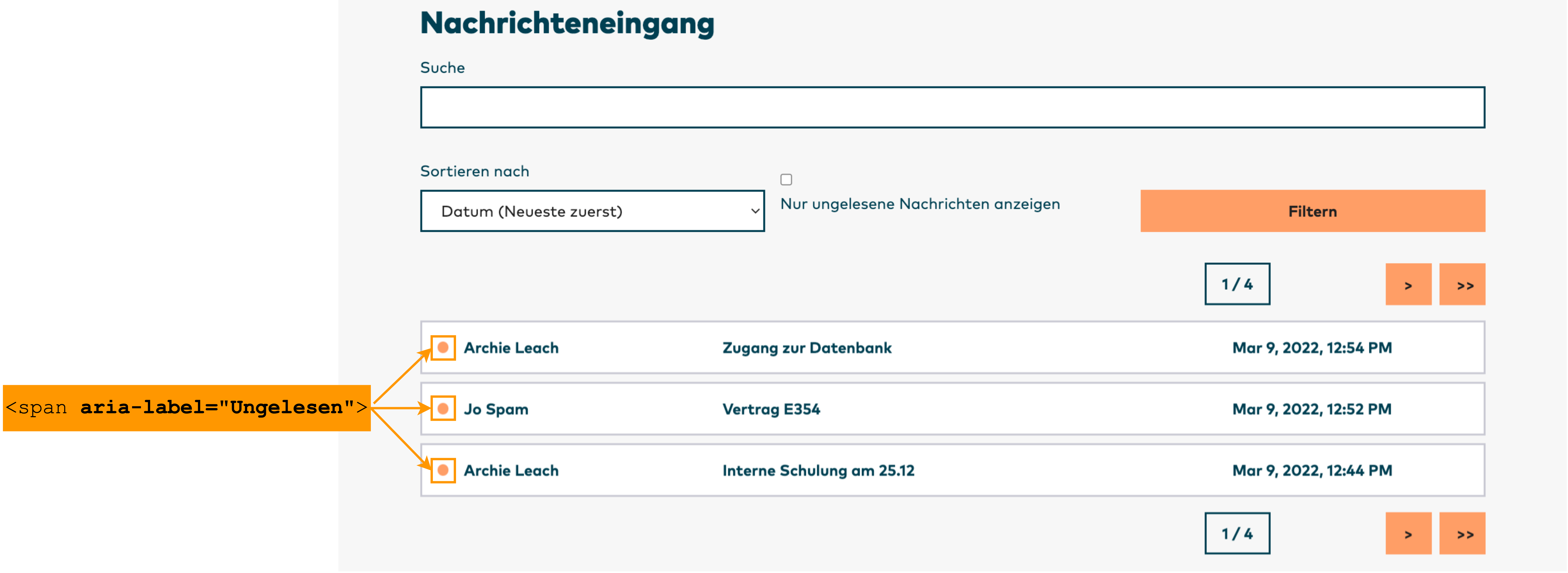
Extensive list elements
On the Crimson Assurance site, every customer appears in their own tile with name, address, date of birth, and email address. The tiles are embedded in an unordered list. A screen reader user is informed of the number of displayed customers in this way. The list of the last customers is labelled with aria-label as “Last customers”, for example. Based on the list structure and the labelling with aria-label, a screen reader outputs: “Last customers list with 5 entries”.
Because a screen reader is able to skip directly to this list, this information considerably simplifies orientation. When such a skip is performed, the focus is on the first element of the list and the first line of the first element is also read out. In the example, the output is: “Last customers list with 5 entries George Burke”.
As another feature to improve accessibility, the email addresses in the respective customer tiles are linked to the name of the corresponding customer with aria-describedby since email addresses do not always contain the full real name of the individual.
aria-describedby refers to the ID of the element to which it is linked. In the example, the name receives the ID “customer-id-a2”. In the email link, aria-describedby refers to this ID. If a screen reader reads out the email address, it will also read the linked name after the email address. In this example, the output is: “Email: [email protected] George Burke”. Without aria-describedby, the name would not be read.
On the Crimson Assurance site, the code with list labelling and linking looks as follows:
<ul id="last-customers" aria-label="Last customers">
   <li>
      <a
      href=".../portal/de/customers/a2">
         <h3 id="customer-id-a2">George Burke</h3>
         <p>Musterstrasse 12, 12345 Musterstadt</p>
         <p>Date of birth: 04.11.2000 </p>
      </a>
      <p>
         <a href="mailto:[email protected]" aria-describedby="customer-id-a2">
            Email: [email protected]
         </a>
      </p>
   </li>
   ...
</ul>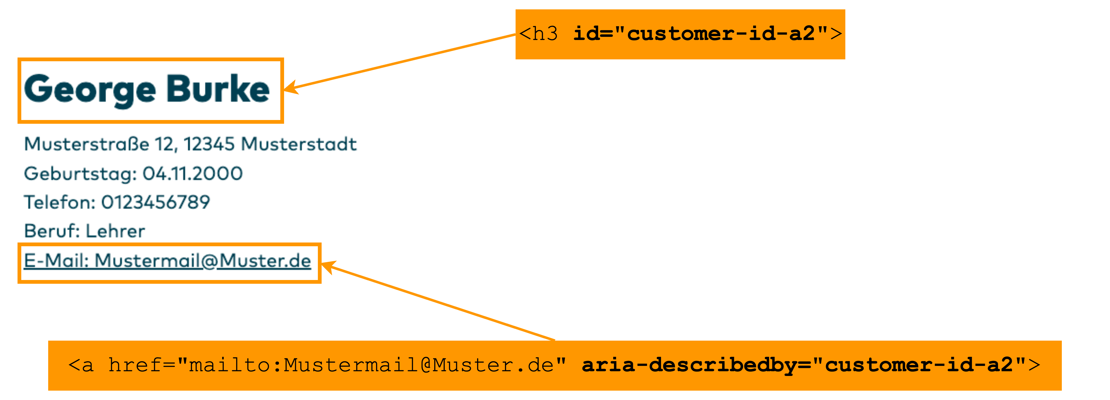
Pop-up Menus
On the Crimson Assurance site, the user menu in the main navigation shows the logged-in user the number of unread messages they have from colleagues. Upon activation of the button, the menu shows a preview of the first five unread messages. When the link “More messages” is clicked, all unread messages appear under this in the messages window with activated filter “Only show unread messages”. If there are fewer than five unread messages, the link “More messages” still appears in the pop-up menu, even if no unread messages are present. On the messages page, it is possible to view all messages.
In order for a screen reader to identify that this is a pop-up and whether or not the overview of unread messages is currently displayed, the ARIA attribute aria-expanded with the value true is used if the pop-up is expanded and the value false if it is collapsed. Otherwise a screen reader user would not learn that clicking on the display of the number of unread messages would reveal additional information. The screen reader would consider the pop-up to be a simple button that does not disclose its ability to expand.
With aria-haspopup="true", a screen reader detects that this is an expandable menu that is overlaid over other content when expanded. To inform a screen reader which list is presented when the menu is opened, it is necessary to label the list in the <ul> tag with an aria-label. The label “Preview: Unread messages” used here makes clear in just a few words what is shown in the list. It is not necessary to include in the list label that it only contains the first five unread messages. A screen reader detects a list with six entries, specifically five unread messages plus the link “More messages” for accessing all unread messages.
The code for calling up the last five messages of a user after opening the button with the display of two new messages and for the display of these messages with opened preview containing message subject and date looks as follows in the example application:
<button aria-haspopup="true" aria-expanded="true">
   <span>
      2 new messages
   </span>
</button>

<section>
   <ul aria-label="Preview: Unread messages">
      <li>
         <a href=".../postbox/de/messages/9/">
             <h3 id="messages-id-9">
                 <span id="message-status-9" class="unread-icon"
                 aria-label="Unread">
                 </span>
                 <span>
                    <span>Jo Spam</span>
                    <span>Contract E355</span>
                    <span>19.06.2022, 01:49</span>
                 </span>
             </h3>
          </a>
       </li>
       ...
       <a href=".../postbox/de/messages/inbox/">
          More messages
       </a>
    </ul>
</section>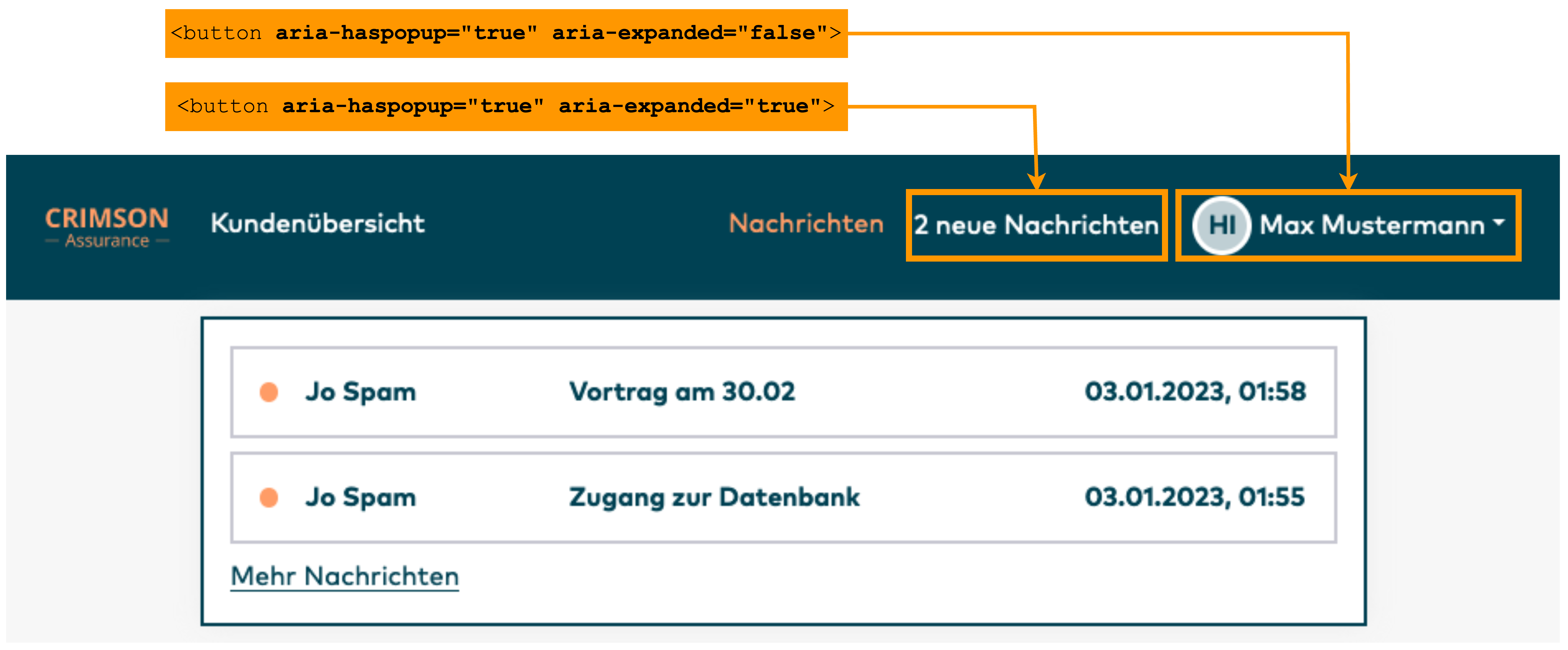
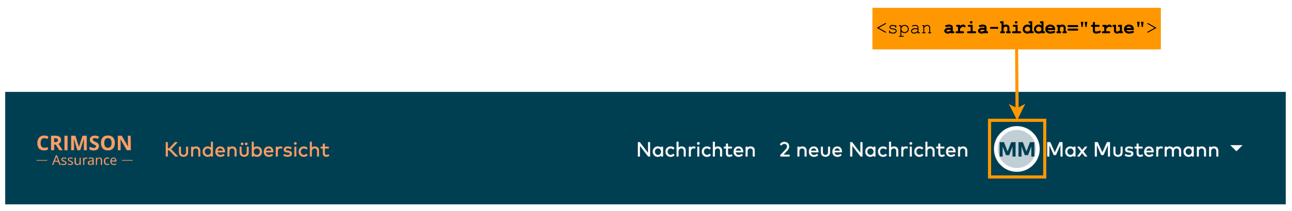
The user menu in each header of the website also contains an avatar and the name of the currently logged-in user. If the first is absent, this area contains the user’s initials. Since this does not provide any added value with regard to content and serves rather as an aid to understanding while complicating the efficient recognition of information, this is hidden for readers on the Crimson Assurance site via aria-hidden.
When clicked, the button “Username” opens a menu that offers the option to log out. As with the overview of unread messages, aria-expanded="true" and aria-expanded="false" indicate an expandable menu and its state. With aria-haspopup, the screen reader identifies that clicking on the button opens a submenu that is overlaid over other content.
The code on the Crimson Assurance site for the button and the pop-up menu in the closed state looks as follows for the fictitious user Max Mustermann:
<li>
   <button data-toggle="dropdown"
   aria-haspopup="true"
   aria-expanded="false">
      Max Mustermann
   </button>
   <a
   href=".../portal/de/logout">
      Log out
   </a>
</li>
Tables
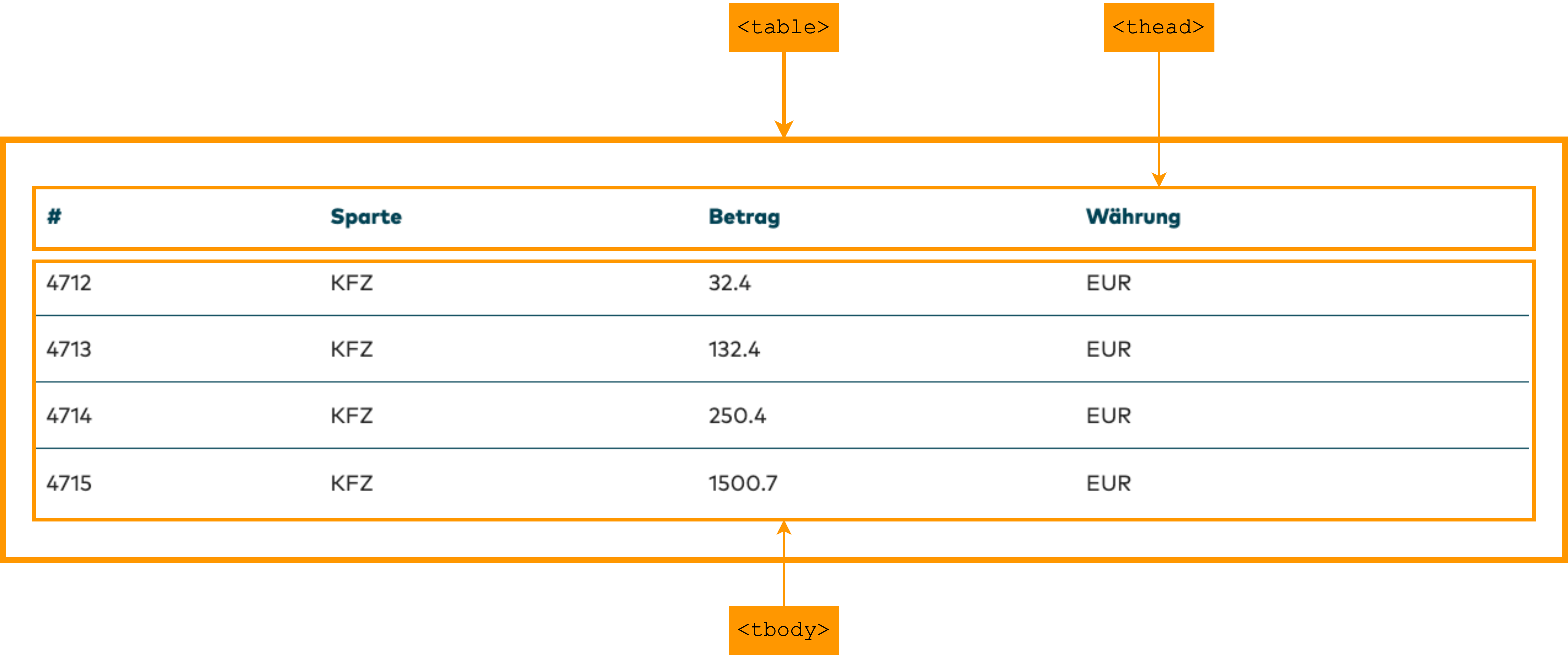
When a customer is selected on the Crimson Assurance site, a web page opens with the customer’s data. This is divided into personal data with name, address, date of birth, telephone number, profession, and email address plus data about the current customer portfolio, consisting of contracts and offers. Contracts and offers are each succinctly displayed in tables.
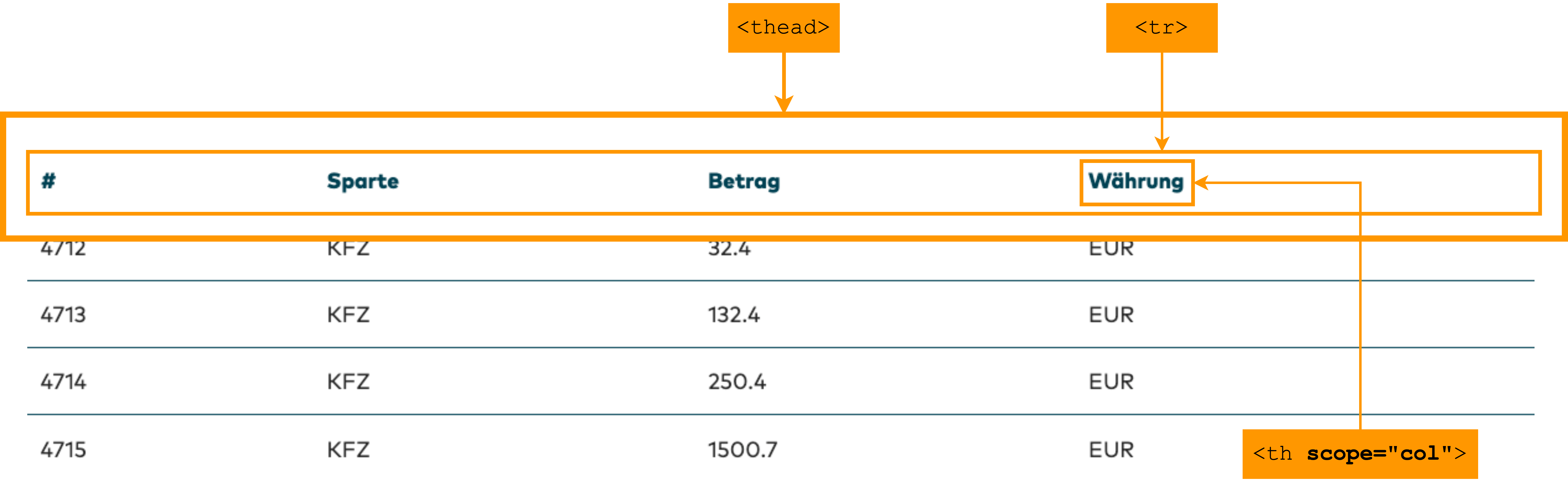
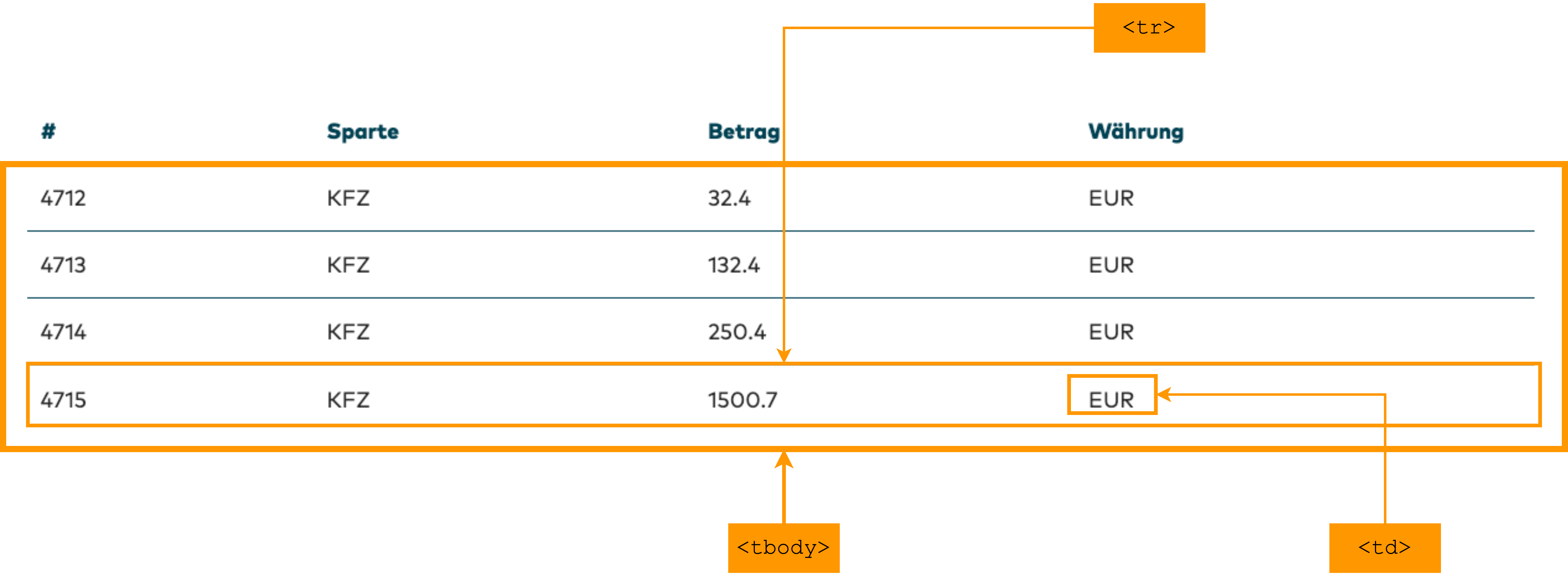
A screen reader can skip directly to tables and analyze them. Good navigation is possible here by reading entire columns or rows or by navigating from cell to cell. This requires creation of a syntactically correct table using native HTML elements. In order for a screen reader to detect it as a table, it must be an enclosed within a <table> tag. The indication of <caption> generates a table caption, which is read out to a screen reader user when they skip directly to a table via keypress. Without a table caption, the output would only be something like “Table with 5 rows and 4 columns”. With a caption, the screen reader generates roughly the following output for a table with contract information: “Contracts table with 5 rows and 4 columns”.
On the Crimson Assurance site, the label within the <caption> tag is only visible to assistive technology because corresponding headings already indicate whether it is the table with contracts or the one with offers. An additional indication for assistive technologies is nevertheless useful for screen readers since this makes clear what data is shown in the table when the user skips directly to it. This caption can be visually hidden and only conveyed to assistive technologies using the Bootstrap class "sr-only", for example.
The <thead> tag creates a group of column headings, while the <tbody> tag groups the table content into rows and cells. Each column and each row of a table requires a heading, which is defined with the <th> tag. The scope attribute within the <th> tag informs a screen reader whether this is a column or a row. scope=“col” marks a column and scope="row" a row.
This information has no visible effect. However, it does ensure that a screen reader will read out the name of the row or column every time the row or column is changed. Especially in large, complex tables, this simplifies navigation and orientation tremendously.
On the Crimson Assurance site, the table with the overview of contracts for a specific customer is structured as follows:
<table>
   <caption class="sr-only">Contracts</caption>
   <thead>
      <tr>
         <th scope="col">#</th>
         <th scope="col">Type</th>
         <th scope="col">Amount</th>
         <th scope="col">Currency</th>
      </tr>
   </thead>
   <tbody>
      <tr>
         <td>4712</td>
         <td>Auto</td>
         <td>32.4</td>
         <td>EUR</td>
      </tr>
      ...
   </tbody>
</table>