

It’s your goal to achieve the „Certified Professional for Software Architecture, Advanced Level”, a qualification issued by the renowned International Software Architecture Qualification Board (iSAQB).
During your long journey toward this important milestone, you have endured many (hopefully interesting and valuable) hours of accredited iSAQB training, collecting the required 70 credit points.
As a final challenge, you need to prepare an approximately 40-page-long document, an architectural solution to a problem given by the iSAQB.
That document will be peer-reviewed by two independent individuals (CPSA-A examiners or reviewers) who are knowledgeable and experienced in software architecture.
Our background
We (Gerrit and Gernot) have worked as CPSA-A examiners since the early days of that qualification program. Together we have read, digested and extensively commented on more than 40 examination papers.
Some of them were great. But quite a few annoyed us with recurring errors – no matter what industry, architecture, or technology was involved.
This post collects some of these anti-patterns. It might help you find the best way to drive your examiners crazy, and make their lives harder than necessary.
Just in case you belong to the group of friendlier types of architects, you will find some ideas that can make your CPSA-A examination a little better – or at least can help to convey your ideas to your examiners.
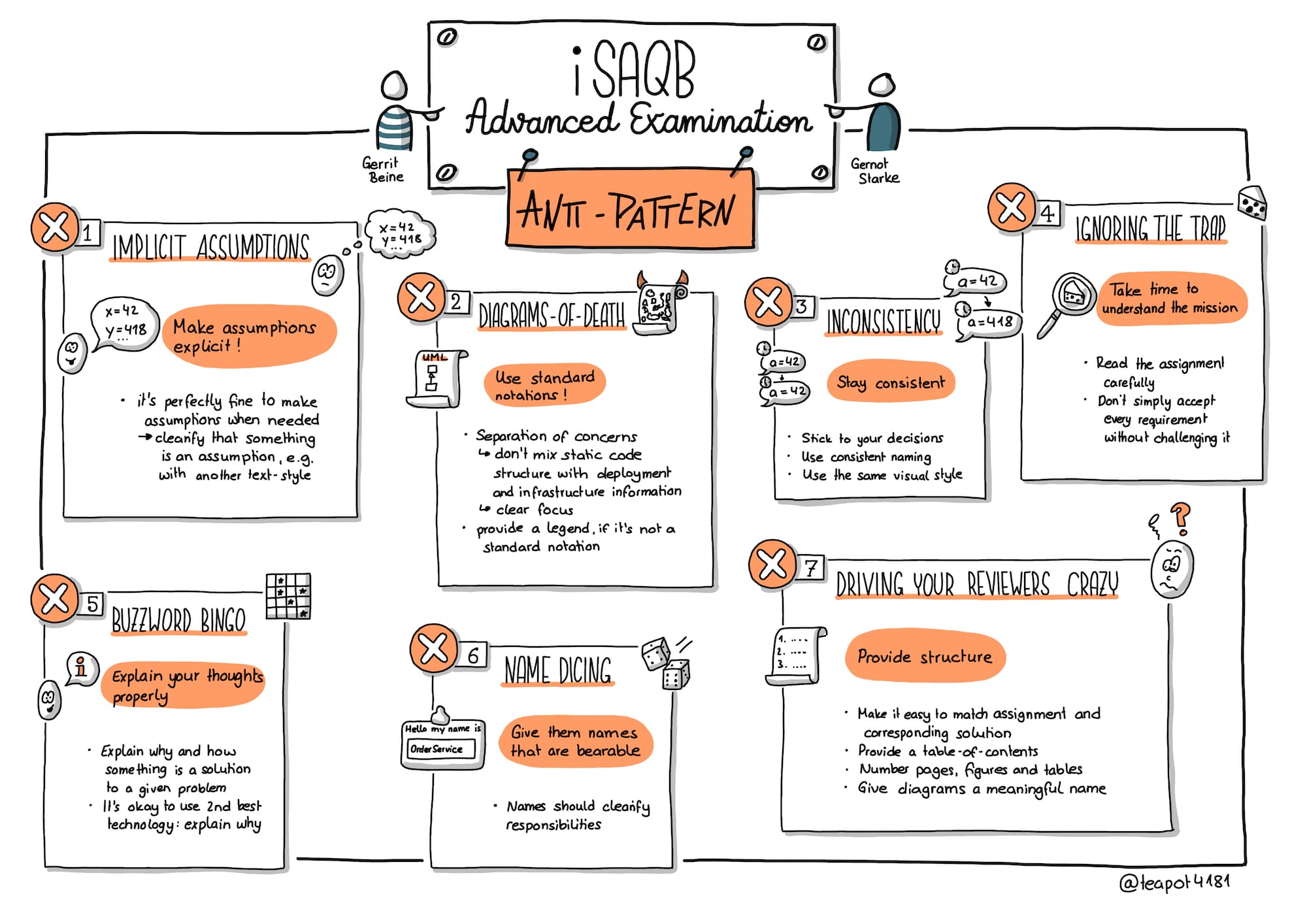
Anti-pattern 1: Implicit assumptions
Why make any of my precious assumptions explicit, when examiners can derive them from my text and diagrams? Why differentiate between facts and assumptions, when natural language provides a multitude of options for uncertainty?
The genius of your assumptions will surely become obvious to the mundane examiners once they have cleared their mental fog.
Be kind to your audience: Make assumptions explicit
Simply because reviewers don’t like decisions that fall out of the blue sky without any reasoning.
In contrast to real-life projects, CPSA-A assignments are documents-only, without the option to ask questions or get feedback. Many of these assignments deliberately contain omissions, ambiguities, or similar deficiencies you would normally clarify with your stakeholders. It’s perfectly fine to make assumptions in such situations – but these assumptions should be made absolutely clear.
If your text processing technology allows, visually differentiate your assumptions from normal text.
Anti-pattern 2: Diagrams-of-Death
Why spread several types of information over various diagrams, when you can easily squeeze it into a single graphic? Why care for the (old) idea of separation of concerns – you are apparently capable of handling dozens of parallel information channels! Why use boring standard notations, when your favorite graphics editor has these fancy, colorful icons and vast symbol library?
Colorful and huge diagrams look impressive. When you are a famous artist, you can auction off these paintings to famous museums for outrageous sums.
Be kind to the not-so-artistic reviewers: Use standard notations
Simply because most examiners lack expertise in modern art – and will expect clarity and conciseness in your diagrams. They might not be able to handle an overload of information in a single diagram, and will surely prefer diagrams that can easily be digested.
You won’t get bonus points for strictly adhering to the latest UML meta-meta model – but using any standard or at least well-known notation enhances understandability.

Fun fact: More than once people tried to combine static code structure (the arc42 building block view) with deployment and infrastructure information (arc42 deployment view). On top of these diagrams, they showed various actors and added runtime information (arc42 runtime view). All combined in a single diagram – needless to say these pictures (we cannot bring ourselves to call such stuff a diagram any longer) came without any additional explanation. We hope you can imagine the uselessness of such pictures (or watch this video)
So, do yourself and your reviewers a favor and create distinct diagrams with a clear focus. Use a standard notation or – if this is not possible – add a legend describing the symbols you use.
Anti-pattern 3: Inconsistency
Why stick to a decision described on page 1, when you can easily invert it on page 2? And twist it 42 degrees on page 39. Why have identical external interfaces in your context view, when it’s incredibly easy to include completely different external systems in your building block view (in case such a thing is required in your examination). Why use consistent naming for a thing or element throughout your document? Variability makes documents less boring. Why use the same visual style across multiple documents, when your drawing tools have so many different types of boxes and lines?
Be kind to yourself: Think before you write
Simply because consistency in your document proves that you have developed a consistent mental model of your architectural solution in your brain. Technical documentation should contain as few surprises as possible – and being inconsistent is a dangerous source of such surprises.
Reviewers will surely be confused when you offer too many different solutions to the same question. In the worst-case scenario, these differences are only subtle and spread all over your document – making it even harder for reviewers to spot them.
If you hide your inconsistencies cleverly enough, the reviewers won’t even notice them. In such cases, you win the hide and seek game. But rest assured – IF they find them, it means tough questions for you in the upcoming phone interview.
Anti-pattern 4: Ignoring the trap
Why read the assignment completely and exactly, when the first sentences already clearly state what is required? Why watch out for nuances of written descriptions or questions, when the level 1 heading of the document contains enough information? Why should I question my implicit assumption about the overall task or parts thereof?
Be kind to your team: Take time to understand the mission
Some assignments contain requirements that are difficult or nearly impossible to fulfil. Like real-world stakeholders that casually demand miracles from a development team to be implemented by noon the following day.
Many such statements have been deliberately placed within the iSAQB assignments. Advanced software architects are capable of identifying risks within requirements. They can explain that and why certain processes, activities, or requirements will impose high cost or effort in development, infrastructure, or operations. They don’t simply accept every requirement without questioning or challenging it.
In case certain parts of your assignments or tasks don’t seem viable for you, explicitly mention that (see above, anti-pattern 1). You can provide an alternative or workaround.
As an example: If it is required to implement a certain algorithm in your architecture but you don’t have the required input data for that algorithm available, you should definitely mention that in your documentation. At best, you provide an alternative algorithm that can cope with the missing information.
Anti-pattern 5: Buzzword Bingo
Why not just take some Wikipedia titles or the cover topics of your favorite developer magazine’s last three issues? Why waste time explaining your reasons for proposing a certain technology? Why not list dozens of tools to show that you have really heard of them all?

Normal people (like us) call such things „buzzwords” – and the game is „buzzword bingo”. The rules are simple: Use as many buzzwords as possible, making your documentation sound like a multicolor marketing brochure for a (really expensive) software tool.
Those who explain anything in detail lose the game.
Be kind to your conscience: Explain your thoughts properly
Don’t tell your reviewers that the Cloud is the solution, without explaining why and how. Don’t base your solution on any buzzword, product, vendor, or miracle without explaining how and why that miracle works in your specific situation.
CPSA-A is not a game of buzzword bingo, but is designed to show that you are capable of consciously making technology decisions and explaining them to your stakeholders.
It’s OK to use the second-best technology as long as the explanation is plausible. Take some time and describe the reasons that led to your decision. You can demonstrate experience if you also mention some disadvantages or risks of your decisions.
In our opinion, it’s better to lose in buzzword bingo and succeed in the iSAQB examination.
Anti-pattern 6: Name dicing
Why should you use names that make it clear what the responsibility or task of an architectural element is? Why name interfaces, data flows, or other dependencies at all? Arrows in diagrams have sharp ends; that should be sufficient for everyone.
The guessing game becomes more interesting when all components are named after planets from Star Wars and all actors are named after the gods of Olympus.

Be kind to your children: Give them names that Are bearable
To be honest, if „Wonder Woman” calls „Frodo” to fetch the latest „Republic Rebels”, it’s not the same as if the „DeliveryProcessor” calls the „OrderService” to see if there are some new „ReadyForDeliveryEvents”.
Although there are still organizations that see naming as a fun challenge, participating in this challenge makes your document almost impossible to understand.
But of course you don’t need to agree with that.
Anti-pattern 7: Driving your reviewers crazy
Why create a table of contents, when reviewers need to read the whole document anyway? Why put a proper title below a diagram, when the sheer beauty of its layout conveys more meaning than a mundane string could ever do? Why add page numbers, as long as the page count remains below 0x2A?
Be kind to your reviewers and provide structure
Simply because your reviewers will be bad-tempered if you ignore even a single one of these topics. These guys read your document in their precious spare time – and you should make their job as smooth as possible.

You’re not rewarded for perfect layout or typesetting, but adhering to some fundamental principles of documentation seems a good idea:
- As reviewers might have their own way of digesting your content, you should facilitate navigation within your document. At least provide a table of contents for your top-level headings.
- Number your pages, figures, and tables, so reviewers can reference these elements in their critique (sometimes they actually dare to criticize your oeuvre).
- Make it absolutely clear which one of the examination questions you are answering in which part of your document. Explicitly refer to those questions, for example by naming your headings in that way. Even if the heading „Answer to Question 3” seems boring, it helps a reviewer understand the structure of your document.
- Give diagrams a meaningful name. At least that proves you mastered the difficult art of naming things (which is one of the major problems in computer science, alongside cache invalidation and off-by-one errors).
Conclusion
We (Gerrit and Gernot) have seen all these anti-patterns way too often. Please be kind to your reviewers and invent some new kinds of quirks, rather than repeating the old ones. May the force of convincing arguments, clear structure, and effective communication be with you.
Acknowledgements
Thanks to Markus Harrer for inventing the term „diagram of death”. Thanks to Lisa Moritz for creating the sketchnote of this article.